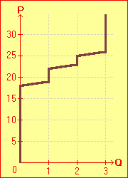
Smith's Supply Schedule can also be represented graphically, as shown at the far right. By convention in supply and demand schedules, the per-unit price of a good is shown on the vertical axis, while the associated quantity of the good is indicated by the horizontal axis ( ). The graph is derived by plotting the points from the chart and then connecting then into a continuous line. Following the graph, we see that Smith supplies no cows until the price rises to 19 hens, when he supplies 1 cow. The quantity he supplies (Q) increases again at P=23 and at P=26. Q never exceeds 3, since he only has 3 cows to trade. Observe the characteristic trend of the supply schedule, which rises from left to right. ). The graph is derived by plotting the points from the chart and then connecting then into a continuous line. Following the graph, we see that Smith supplies no cows until the price rises to 19 hens, when he supplies 1 cow. The quantity he supplies (Q) increases again at P=23 and at P=26. Q never exceeds 3, since he only has 3 cows to trade. Observe the characteristic trend of the supply schedule, which rises from left to right. 
|
|
Smith's
Supply Schedule
| P (hens per cow)
|
Q (cows)
|
| 26 | 3 |
| 25 | 2 |
| 23 | 2 |
| 22 | 1 |
| 19 | 1 |
| 18 | 0 |
|
|
 |